Color is regarded as an International visual language understood all over the world. It plays a very significant role in our lives and we cannot tend to overlook it. In interior design, it is an important aspect and should always be carefully thought of. Any good design professional will repeatedly tell you how powerful color can be. As they say, color can make or break your design.
Thus, it is essential to have sufficient knowledge on colors if you wish to have a good interior. In this article, five bold color combinations that can serve as inspiration for your new home will be discussed.
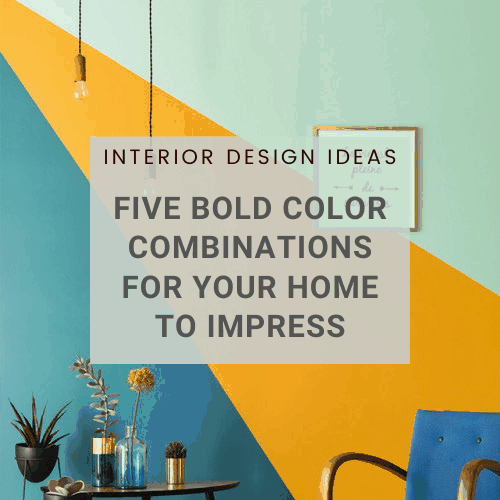
BASICS OF COLOR FOR INTERIOR DESIGN
Before we proceed with the color combinations, let’s discuss its basics. First and foremost, take note of the difference between light and dark colors and what each can bring to the table. Light colors are usually airy, and as a general rule make rooms look larger and brighter. On the other hand, dark colors give an intimate feeling because of it’s sophisticated and warm characteristics.
The common colors have different takes and each represent various values and characteristics. For example, white can give clean, innocent, soft, and pure impression. Red gives a feeling of power, energy, and strength. Green provides freshness and symbolizes the environment. Blue is more professional and secure. Black is sophisticated, elegant and classy. Orange gives an optimistic and confident feeling. Yellow represents creativity, happiness, and motivation, while pink reflects a tranquil and sensitive environment.
Colors can be used in many ways. It can be used as stand-alone or it can also be used in combination. In this article, we will focus on the latter, particularly the combination of bold colors for interior design. Bold colors are defined as rich, bright, and extremely vibrant colors that can either be primary or secondary hues.

PhotoCr: Apartment Therapy
FIVE BOLD COLOR COMBINATIONS FOR YOUR HOME
Using bold colors for your home can raise a few eyebrows especially among the traditional and the early. But it’s already the year 2020 and the trend is to make bold statements. There’s no better way to make a bold statement than to use bold colors for your home, right? As they say, Bold is the new Black!
When combining two high-contrast colors, it doesn’t necessarily have to be gaudy or too dazzling. You just have to use two right colors to provide balance. When you do this right, you can create an interesting and sophisticated mix that can impress anyone. If you are yet to be convinced, check out these five spaces that used bold color combinations. Too see is to believe, isn’t it?
Katie Brown, an American TV personality known for her fondness of art and interior decoration welcomed the media to her home in Connecticut, USA. Her whole house basically exemplified beauty in combining bold colors. Katie Brown was proud of how her design turned out, and the finished product impressed even her kids. When interviewed, she went on to say, “When my daughters have friends over, they’re really proud that their house is a big statement!”.


PhotoCr: House Beautiful
Electric Blue and Vivid Red
Blue and Red are not your usual color combinations. But look at Katie Brown’s guest room and be proven otherwise. As she admits, the guest room was actually a happy accident. “This is what I mean when I talk about your house being a conversation: When we pulled up the wall-to-wall carpet in the guest room, we discovered a red-painted floor underneath—how lucky is that?” said Brown. “I love the red against the electric Blue we used on the walls and ceiling.

PhotoCr: House Beautiful
For Brown, the intention was to end up with an old-fashioned finish. But the combination of blue and red is still seamless for a modern day setting.
 PhotoCr: Apartment Therapy
Grey and Turquoise
Turquoise for some may be too bright, but match it with grey and you’ll get the perfect balance. It’s bold and classy at the same time.

PhotoCr: Home Decoez

PhotoCr: Pinterest
Whether you use grey or turquoise as the main color doesn’t actually matter. Either way, adding up a few hints of brown, white or black through picture frames, displays or lights can make it even better. Check out for pendant lights that can complement the combination of Grey and Turquoise.

Check this out: AGNETA Wood Cap Base Hanging Lamp
Purple and Blue
Purple and Blue individually are both calm and tranquil colors. But when you put them together, you have a palette that’s full of life. Since the two colors are next to each other on the color wheel, you have the luxury to use various shades without fear of clashing. As proven on the two examples, both lighter and darker shades of purple do well with blue while showing completely different personalities. Confused whether to opt for the lighter or the darker shade? As frequently advised, if the room is big, go for the darker shade but if the space is small, the cooler shade is highly recommended.


PhotoCr: Design Build Ideas and Pinterest
Blue and Yellow
Blue and yellow are both primary colors yet when mixed together actually make an electric pairing. Combining the two colors make your interior look dynamic and exciting. You can also mix and match the different shades of the said two colors. If you want a more classy and elegant look, go for a satin finish of blue and yellow.

PhotoCr: Decoriate

PhotoCr: Nippon
Yellow is a color known to help in enhancing memory while blue gives the perfect contrast and mellows the mood of the room. That is why this color combination is highly recommended for your study room. You can then go for a brown (wooden) finish for your furniture and fixtures.

This Erling Classic Wooden Bar Head Lamp will go well with blue and yellow. Check it out.
Orange and Blue
Looking at the color wheel will show you that orange and blue are directly opposite each other. This is why the two colors are regarded as complementary colors. Combining the two colors results in something dramatic and exciting.
Orange is the color of laughter and celebration. When mixed with white, the two colors create an ambience good for a happy family. Adding blue into the mix gives the perfect contrast, taking away blandness of just the first two colors while giving a wow factor.

PhotoCr: Apartment Therapy

PhotoCr: Behance

Shop for this: INGEGERD Creative Geometry Ceiling Light
Truth is, bold colors are in and they’re here to stay. If you want to be in on the trend and make a statement, use these five bold color combinations for your home. You’ll surely impress!
FAQs
1. Why should I use bold color combinations in my home?
Bold colors add personality, energy, and visual interest to a space, helping create a unique and memorable interior style.
2. What are some examples of bold color combinations that work well together?
Popular choices include navy blue and gold, emerald green and blush pink, black and white, mustard yellow and teal, or coral and turquoise.
3. How can I use bold colors without overwhelming my space?
Start with one feature wall, accent furniture, or decor pieces in bold hues and balance them with neutral shades like white, beige, or grey.
4. Which rooms are best for experimenting with bold color combinations?
Living rooms, bedrooms, and dining areas are great places to add bold colors, as they offer space to showcase creativity without overpowering functionality.