For most who aren’t designer/art trained, we often rely on our instincts when it comes to creating a colour scheme for our homes. Surely we may not be well versed in colour theories or terminologies like hue, saturation, tint or shades. However, whatever looks good cannot go wrong, right?
Yet sometimes, instincts do lead us to wrong places, and your house may end up looking cluttered with a myriad of incohesive colours! This is especially so since homes are slowly departing from the basic minimalist style, which mostly deals with the few basic colours. Houses these days are fans of Colour Pops, soft pastels/loud funky colours. This article shows homeowners who have ventured into this treacherous terrain of colours and emerged victors.
Creative Modern Geometry

In this Bendemeer apartment by The Scientist, the owners adopted the monochromatic colour scheme. One in which colours chosen are made up of different shades and tints within the same hue. In this case, the hue of blue/green takes centre stage. It is juxtaposed with pale wood, which makes the house seem airy and light. This ensures the house is not totally weighed down by the heavier colours. Coupled with the geometric wall and hanging pendant bulbs, this open concept home spurs creative expression.
Home Sweet Home

Just like the aforementioned house, this Tampines flat by Kejico has a generally monochromatic colour scheme. This time round however, with warm tones. The warm tones of the furniture blend in seamlessly with the brick wall, and the pop of pink makes it a sweet & cosy living space.
Safari House

In this Upper Serangoon apartment by The Scientist, owners dedicated a wall to the colour forest green. This green brings a sense of zen/nature into the living room and is neatly complemented by the differing wood features. Besides this classic greenXwood combination, the adventurous owners also introduced mosaic tiles and a dark blue leather sofa. The eclectic mix of all elements gives the house a certain fashion sensibility. That aside, the myriad of colours employed also sets the mood for an adventurous spirit.
If you are a fan of green like the owners above, take a look at these houses below which also rocked green in their spaces.


The first image features owners who played it safe and explored different shades of green while pairing it with the neutral colors of beige and grey.
In the second image, the houses are paired green and pink which are complementary colours. The effect is festive and individualistic.
Pastels to Calm & Cheer

It is no secret that pastels are huge in the industry now. In the Westcoast Apartment by 82, muted pastels were adopted. Rendering a soothing and calm atmosphere to the entire home whilst retaining the fun brought about by the dashes of colour.
Comparatively in the HDBs below, owners utilised bright pastels. Great cheer can be felt immediately with baby blue, green, red and green.
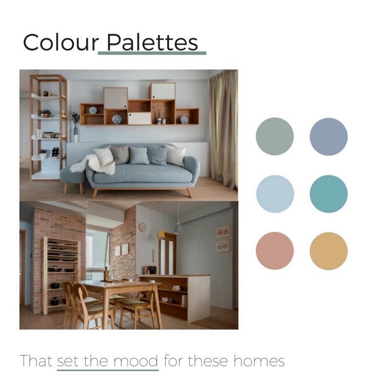
Pastels can be well integrated into minimalistic Scandinavian styles. Take for example the houses below. Depart from your notion that Scandinavian styles revolve around wood, white and greys. Muted pastels and greenery can also be well adopted to achieve a modern Scandinavian look.

Classic Elegance
If you are still unconvinced about introducing a mix of colours into your house. You can stick to conventional colour schemes such as the houses below, and achieve a classic, timeless look.


The first house above in Clementi by 82 stuck strictly to their palette, never deviating beyond browns, greys and white. A classic combination which most houses are familiar with. However, if you want a refreshing change, you may consider the second house’s palette. This Sengkang apartment by Fifth Avenue Interior chose yellow. Since it lies in the same colour family as brown, it still goes well with grey and adds an extra funkiness to the house. The warm colours from the two houses above will surely make your home a cosy haven.
Your house is your canvas, and hence, get creative with your palettes! Colour palettes set the Mood for your house, and your feelings may be subconsciously affected by these colours. Explore the plenty of resources online on colour schemes and colour coordinate like a pro, just like the houses above.
With Screed’s range of modern lighting and design solutions, you can enhance those surfaces even further, allowing them to take centre stage and shine beautifully.
FAQS
How do colour palettes affect the mood of a home?
Colours influence emotions. Warm shades create a cosy feel, while cool tones bring calmness and balance. Choosing the right palette sets the overall atmosphere of a space.
What are some popular colour palettes for modern homes?
Neutral palettes like beige, white, and grey are timeless, while earthy tones and muted pastels are trending for their soothing and natural feel.
Can bold colours work in home interiors?
Yes, bold shades like navy blue, emerald green, or terracotta can add depth and personality when used thoughtfully as accent walls or feature pieces.